
Something I’ve always been somewhat interested in is making photos by mashing different parts of them together in Photoshop. It wasn’t really a high priority in my mind, but it was something I kept in the back of it nonetheless. To my excitement, this assignment involved doing just that.
The objective of this assignment was to create a poster combining only two of the 10 styles that had been learned throughout my “Graphic Design in the 20th Century” course. In Photoshop, you were required to use images that weren’t your own to create something new, while fitting within the guidelines of the styles you chose for yourself. Here, I chose to combine the style of constructivist propaganda and plakatstil.
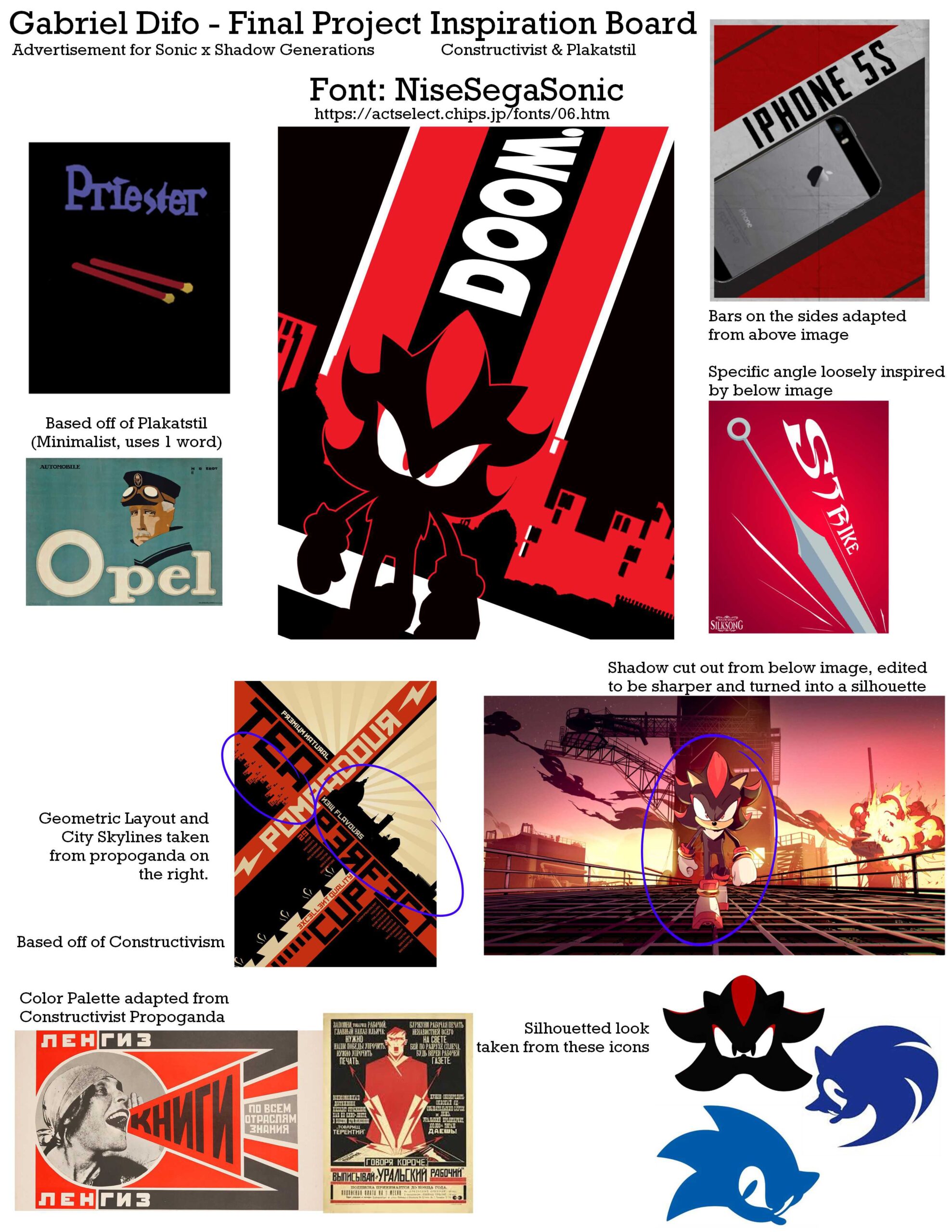
Above can be seen the entire inspiration board for the piece; it tells what exactly was used as a basis, or taken to be used in the image itself. Out of everything I used, the only part that involved significant tinkering was Shadow himself. I had to trace over his body in order to get the silhouette the exact way I wanted it to look.

Unlike many of my other projects, this mostly involved mashing graphics together that I had no part in creating originally. It’s not an art form that I’m particularly familiar with, which presented challenges in and of itself, but I’m glad I was able to tinker around with the idea throughout that entire course. Frankly, it was a nice change of pace— a bit hard to adjust to it, but nonetheless fresh. Years ago, I never thought I’d ever be able to achieve anything like that, and yet here I was doing that exact thing. For that, and for the piece itself, I’m proud.
Importantly, I had to have a bit of foresight regarding what images I used. I sort of lucked out here, but with other projects, it took quite a while to find exactly what I was looking for.
If this got you interested in seeing more, or made you want to collaborate on something, either check out more of my portfolio or get in contact!