
The objective for this assignment was to create a logo to represent the student’s hometown. Growing up, I had never paid much attention to any of the events that occurred in Providence; heck, I wasn’t even aware of the city did anything at all outside of WaterFire. However, this project demanded further research past what I was already aware of, so along the course of this assignment, I would learn a lot more about my city than I did prior.
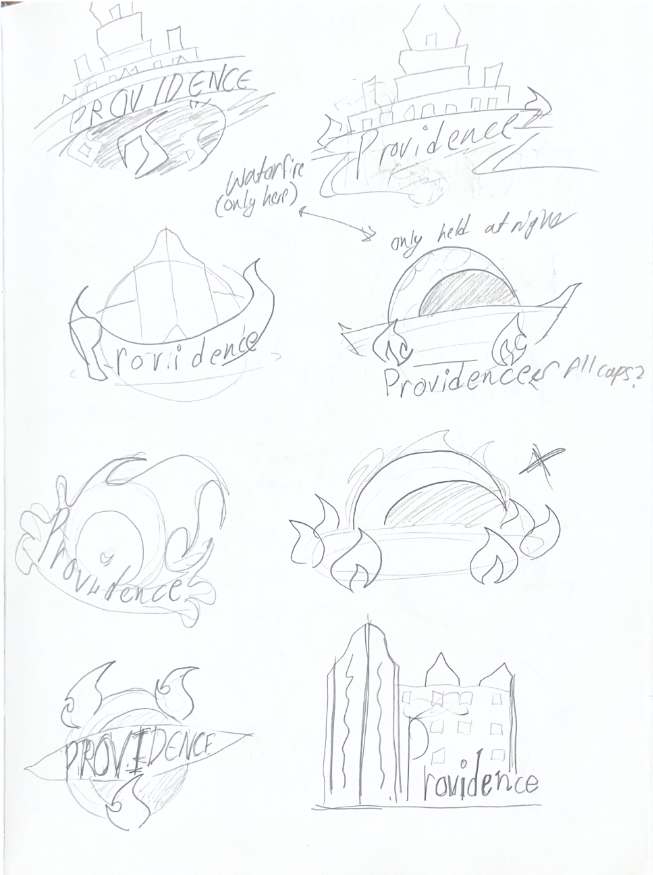
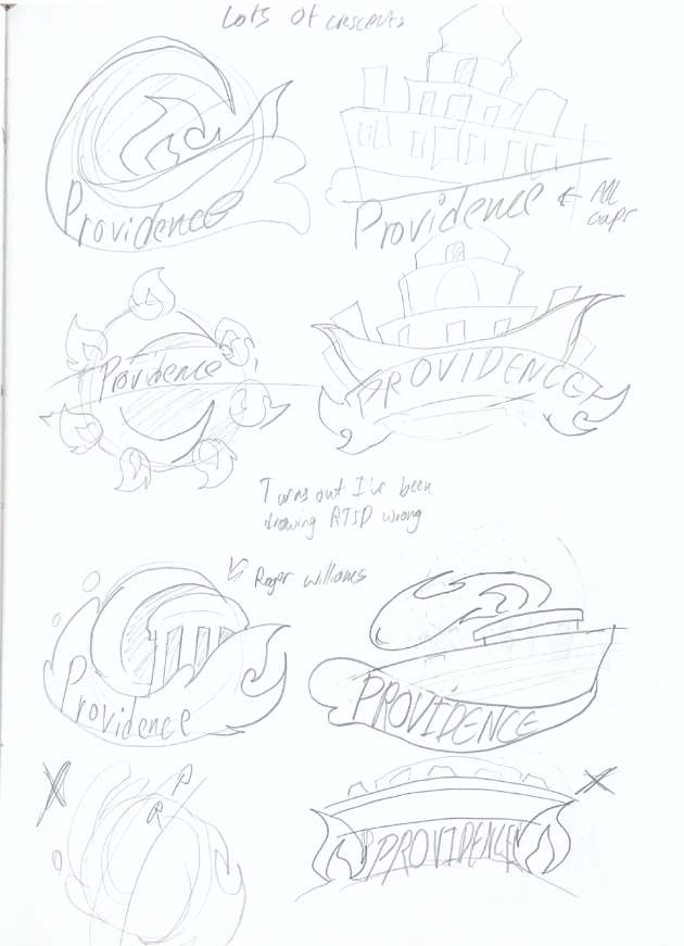
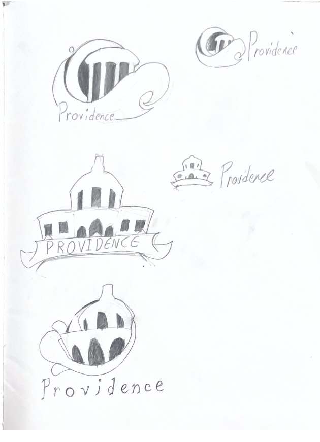
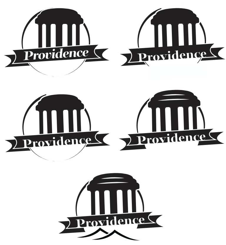
A very large chunk of the sketches I conceptualized were heavily based off of WaterFire, and the associated bridges and boats the were used during the event. Some of those logos also incorporated the moon. A few of them used a gazebo somewhere on Roger Williams Park, which I had taken a great interest in due to the architecture, and others used a silhouetted Rhode Island School of Design building. As much as I enjoyed the look of many of the WaterFire inspired logos, I feel they would end up being too much too niche- on top of the fact that WaterFire is a copyrighted art piece. I would decide to go with one of the more fleshed-out designs using a gazebo, as the ones utilizing RISD felt too generic. IN any case, by far this remains the most amount of sketches I have done for a single project.


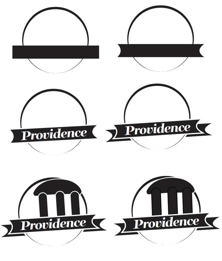
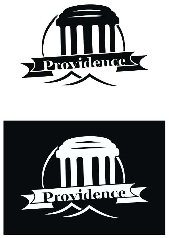
Moving onto the Illustrator progress, you can tell that the design I began making was starkly different to any of the concepts featuring the gazebo. This, in part, is mainly due to the fact that I had a slight bit of trouble trying to replicate the waves efficiently- that, and the text was harder to incorporate on the wave than I had anticipated. Therefore, I took a bit from some of the other designs and went forward from there. Putting together the gazebo was a bit tough considering the shape wasn’t something I had been particularly familiar with, but I think it turned out great. In the long run, the decision to use a banner and simpler waves helped a lot with the shaping of the logo.


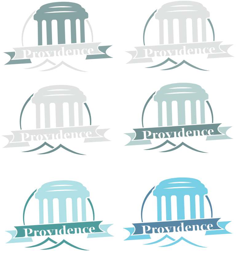
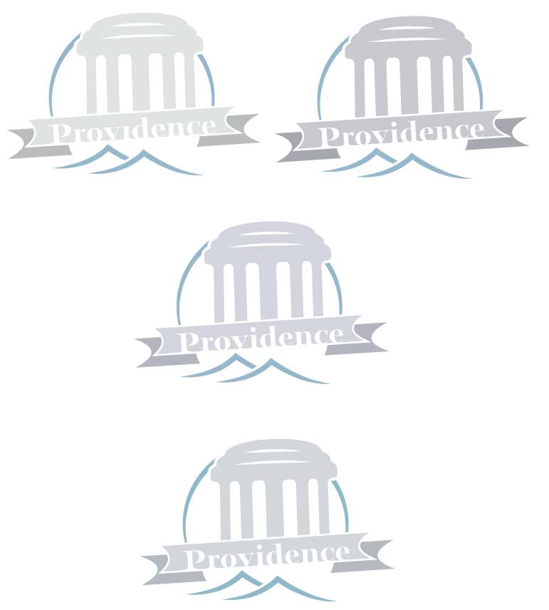
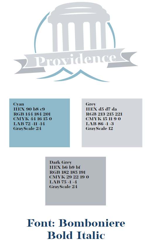
And with the base black & white out of the way, it was time to splash colors onto the design. I knew from the start that the colors would be derived from the gazebo (white or grey), but I also knew that using ONLY white would be bland. I tried using blues or faded greens, and even a copper color for a bit, but I felt that not many of them stuck the landing. Finding a balance between having a grey that wasn’t too light or dark, and a color that wasn’t too saturated but also not completely grey was tough, and the logo went through many more variations. By the end, though, I had settled on 3 colors, two of which being shades of grey, and a third being a faded cyan for the water. I don’t think I could’ve done much better than what I ended up with if I tried, and I’m very pleased by the end result.


After making a palette swatch and black & white versions, the logo was officially complete.
Overall, I feel like this is one of the few projects I’ve done that has gone through so many revisions, especially in the color stage, outside of possibly the Marylou’s Coffee Rebrand assignment. It was definitely a tricky experience, but one I don’t regret going through. I got to learn a lot more about my city in the process, too, as well as clarifying things I had already been aware of.
If this got you interested in seeing more, or made you want to collaborate with me, either check out more of my portfolio or get in contact!