
The objective for this assignment was to create a brand logo for a fictional monthly mail-order product targeted towards 6-10 year olds. A poster with a physical photo was supposed to be included along with the branding. Each month, the clients are intended to receive instructions on how to build a simple robot-like creation, made from every-day household items that can be reused instead of being thrown away, the main intention being to encourage kids to recycle at any point they possibly can.
Below are the all of the sketches that I had made for conceptual logos. I don’t think I’ve ever made something targeted at such a young audience before, but I think my style of doing things tended to lean that way sometimes anyhow. Nevertheless, it was still a bit of a challenge, but I managed to pull through. I looked at a few different “robot” logos on the internet, but many of the designs I thought up hinged greatly on getting the most use out of the recycling symbol and motif. One of the standout ideas I had was making the “L” on one of the logos look like a cardboard cylinder, like the ones you would find on an empty toilet paper roll. I don’t feel too proud of most of the sketch ideas I had here, though. I feel like I was trying too hard to lean into something specific- but at the very least, two of the concepts really stood out to me.
They stood out to me so well, in fact, that I ended up making both of them in Illustrator at the same time. Making the logo with the singular gear with eyes was very simple and didn’t take too much time, but the other was a whole other story. Due to how it was structured, I had to do some funky workaround magic that, in hindsight, I feel could have been executed much better. It didn’t matter too much, though… at the end of the day, I think both looked pretty great.
Now that the bases were done, it was off to coloring, which… didn’t take very long. At the start of the project, I had already had an inking of what colors I was going to put onto the logos– the real question was how to put them on. For the logo on the left, I struggled a lot to get something down that looked balanced, whereas I found it much easier on for the design on the right. Ultimately, as much as I liked the simplicity of the left, it just didn’t leave enough room for experimentation with the way it was put together. Therefore, I went with the right design, using the colors on the bottom right specifically.
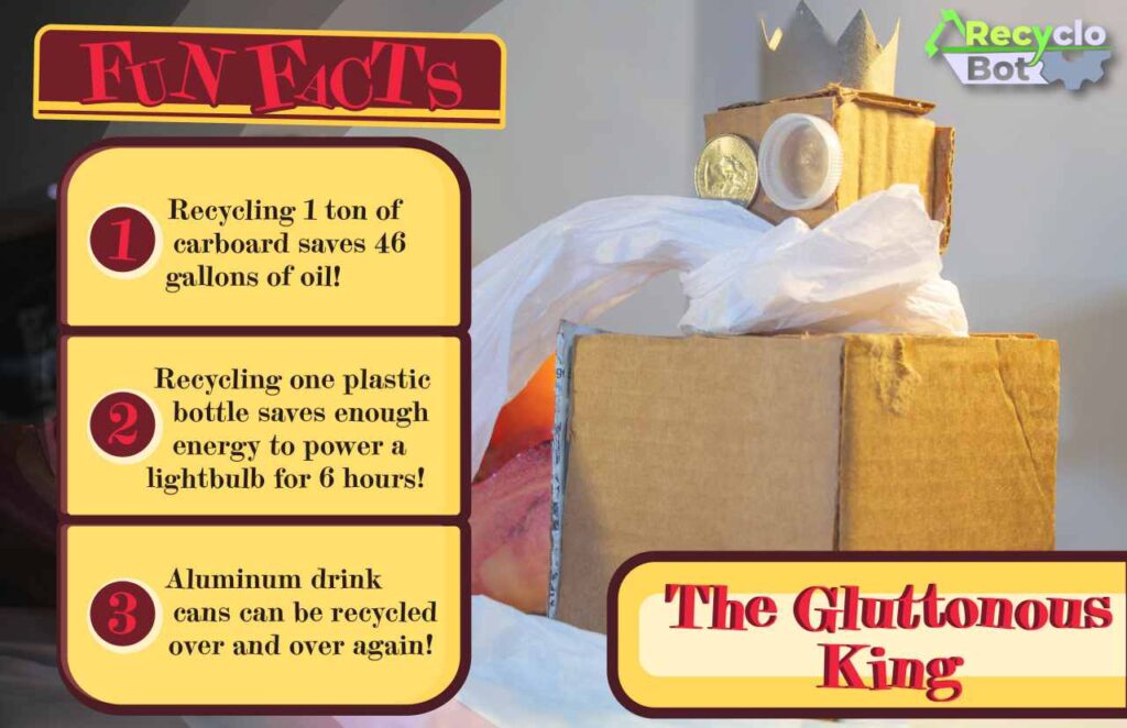
During the process of making the logo, we were simultaneously tasked with creating, and then photographing a legitimate “recyclobot” for a poster with complete instructions. To be honest, physical arts and crafts were not necessarily a strong-suit of mine considering I barely practiced it when I was younger, so I had a bit of a tough time putting together the little abomination I ended up with.
At the very least, I think he looks quite stylish. He still sits atop of my bedroom dresser (albeit, without his crown). Either way, that said, taking the photo itself was also a challenge. I was working with very limited lighting and set supplies, but I think I was able to make due with what I had. Completely white paper and a desk lamp can still go a long way. I still think the photo could have been much better, but for the purposes of the assignment, it turned out fine.

After the photo was the process of putting together the poster and instructions page. I sadly do not have work-in-progress screenshots of neither the front or back, but I have insight at the very least. Around this time, I started realizing that I was using warmer palettes, especially red, a lot more than I used to- which was surprising after going on tirades about how hard it was to use in some cases. This tidbit wouldn’t come up again until the Marylou’s Coffee Rebrand assignment, but I think it’s important to mention it here, as it sort of lays the groundwork for that later comfortability.
Creating the instructions page was, again, another odd deviation from what I was used to… but not too bad. The real kicker was making the materials. Putting all I had learned to use in making actual illustrator replicas of real life items was quite fun- sans wrapping paper.


And that essentially marked the end of the Recyclobot assignment. It was both fun, and a bit of a hassle, all at the same time, but learning that I suck at arts and crafts was definitely… helpful? The logo was also a nice dive into something new, too- although, again, I believe it could have been executed better, but I can’t judge too hard.
If this got you interested in seeing more, or made you want to collaborate with me, either check out more of my portfolio or get in contact!