
The objective of this assignment was to find a local Rhode Island coffee shop that we found to have “subpar branding”, and rebrand it in to make it look better with the skills we’ve learned throughout the GMW course so far. This would eventually be paired with mock-up package designs of Keurig boxes, mugs, cups, outdoor signage, and more, as well as conceptualizing possible points of expansion like with gamification or menu options.
I chose to go with Marylou’s, a small coffee chain which has many locations scattered around Massachusetts and Rhode Island, with a target audience of, largely, young women. Many aspects of the designs around the business felt they could be improved in one way or the other.
To start, the logo felt very amateur, with two main variations that felt very bland and uninspired. The color palette was overbearing, with a muddy very dark grey that did not fit with the abundant pinks. The website and numerous graphics featured on it felt quickly thrown together, with the mobile app feeling bland. All of these, and more, were things I aimed to fix with the full rebrand.
Below, sketches can be found. A large chunk of them play into the fact that the new “sweet/sugary drinks” proposition, based off of their already existing selection.
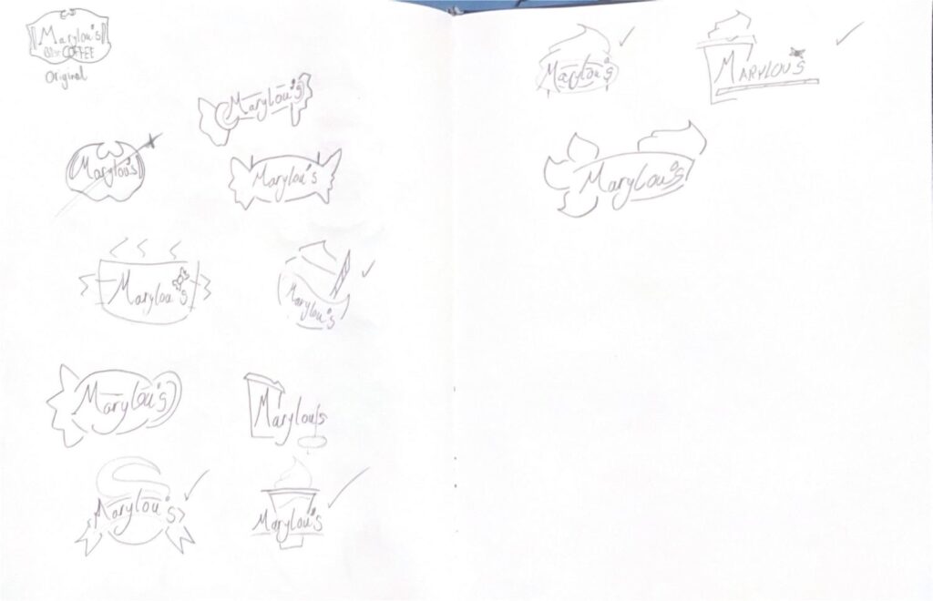
For the time being, I would go with something like the two logos featured on the bottom right of the first page.
While building the logo in illustrator, I kept the kept pink palette from the original logo and brand designs, adding in a darker purple/pink to throw in some variety, with the spiky figure behind the cup meaning to represent some kind of small wrapped candy.
As I built this logo, though, I realized that this wasn’t the direction I actually wanted to take the rebrand in. I wanted something more generalized, while also not appearing too un-serious or comical as this logo had felt. So, I scrapped it entirely, starting from complete scratch, basing the new design off of the bottom left-most sketch.
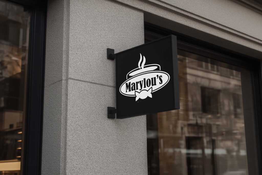
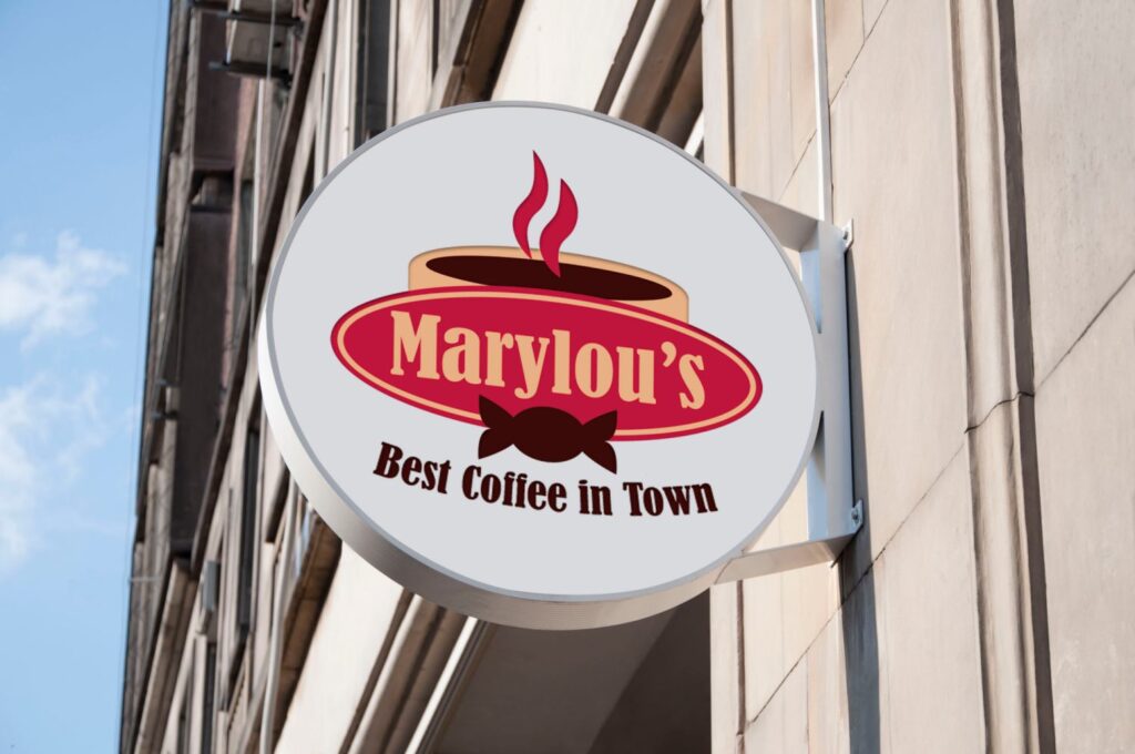
With the new design, I wanted to keep a hint of the old-timey aesthetic that the old logo had with the “saloon doors”. For that, I used an outline on the edge of the sign for the text, and made a simpler candy wrapper that also functioned as a neat little bowtie to convey both at the same time.
For the colors, I needed to stray away from the overwhelming pink that the original brand used. While their identity with said pink was, admittedly, very strong and consistent, it was also harsh on the eyes, and it was used practically everywhere. Instead, I went with more neutral warm tones (red and beige, with brown), which is supposed to be welcoming and inviting. The wavy lines above the mug are meant to further support that feeling.
I used the font Bernard MT Condensed for the main text, as I felt it gave off a sort of “old”-ish vibe. Something that wasn’t explicitly modern, while not dating itself too far back.
Below is the final logo design, with a black and white variant to boot.
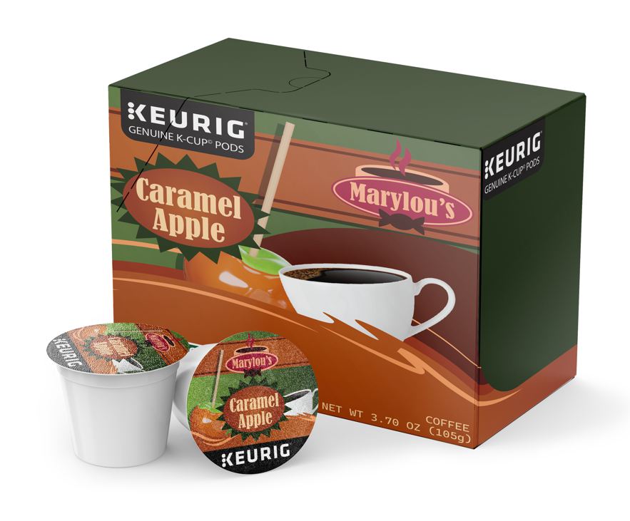
Next up came the package design for a Keurig box. All of the sketches are based off of previous boxes I found, for companies like Dunkin’ and Starbucks.
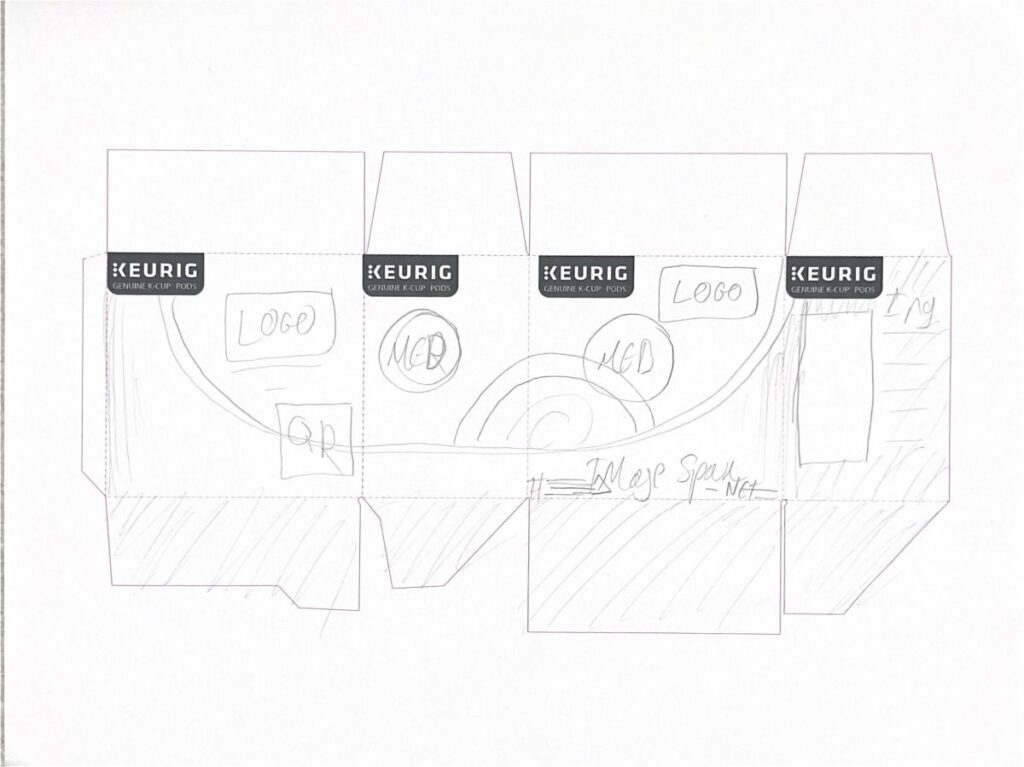
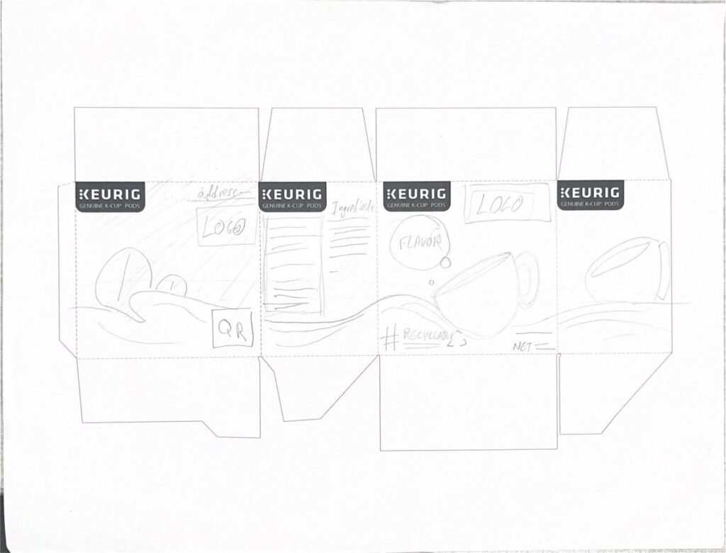
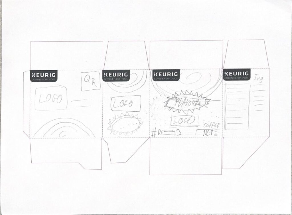
I would end up choosing the second design, as I thought it looked the best in comparison, and was the most feasible. I also liked the idea of the coffee freely flowing all throughout the box layout. I figured using a cooler color for the boxes would help to balance out the warmness of the usual logo– though, of course, this would change on a flavor by flavor basis.
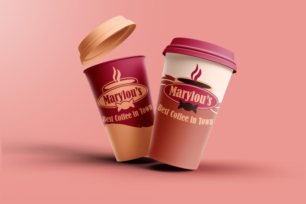
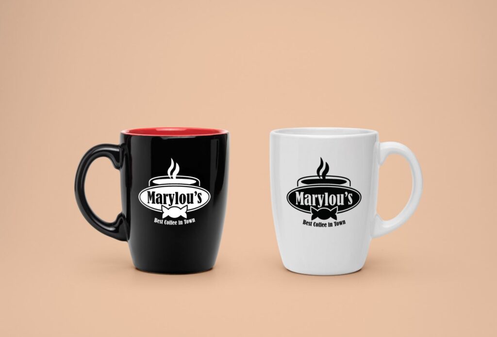
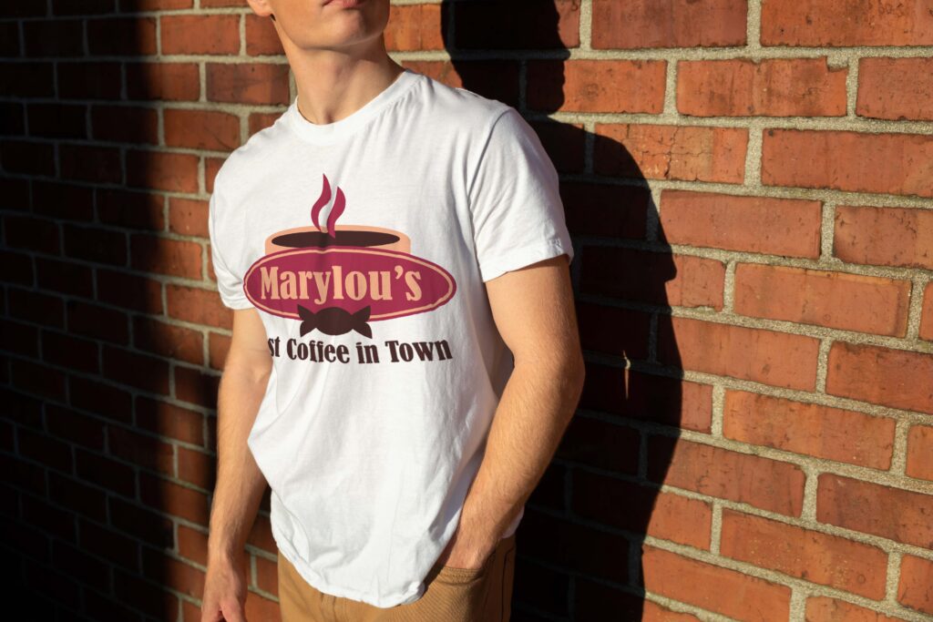
After this, came a bunch of simple mock-ups to cap off the project. These were all done in Illustrator using mock-up photoshop files from Adobe Stock.
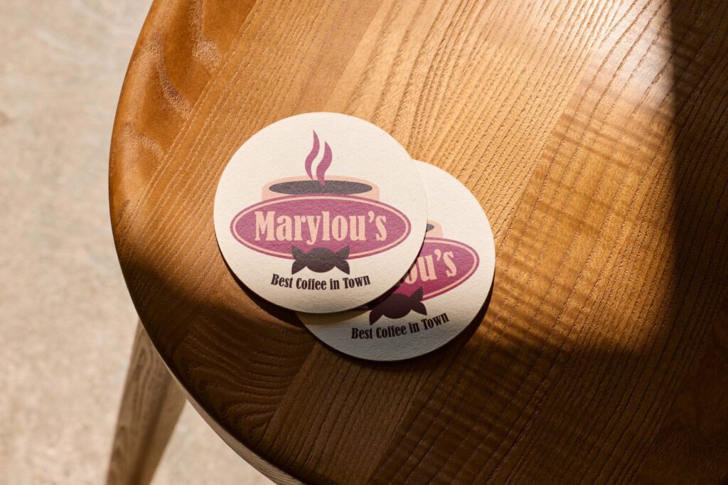

After that, the project was done. The final versions of both the logo and the main Keurig package design are re-posted above for the sake of keeping things together.
Working on this assignment really showed me that I need to be at my best for even the sketching portions of a project. Even though it worked out in the end, it could have gone much differently if I had a stronger idea of what I was trying to accomplish earlier on. I do think I successfully pulled off making a simple and flexible logo design- and having special black and white variants always continues to help in the long run.
This is also around the time where I realized I’ve become a lot more comfortable (maybe, a bit too comfortable) working with warmer color palettes, specifically with shades of red. I used to struggle a lot with them in the past, but I’ve since found them much easier to work around with.
If this got you interested in seeing more, or made you want to collaborate with me, either check out more of my portfolio or get in contact!