
If you’re on this site, then you’re 100% already familiar with our mascot: Fleet!
While technically tied to the overall assignment that was creating this brand, I like to think of them as a bit of a separate project, as much as they are inseparably tied to it.
The goal was to create a simple, likeable but pseudo-mythical mascot to represent the brand. Before sketches even began, I knew they would be a fox. Both foxes and character design are a very important part of my legacy as an artist, and it’d feel very crude to reject both for something that’s supposed to be personal to me. Although, even with that said, I feel they also owe their existence, in part, to Krita, and their mascot, Kiki. I don’t think I’ve particularly seen the concept of an art program with a mascot, and I’m not sure if I would have been pushed to make Fleet had Kiki not existed.
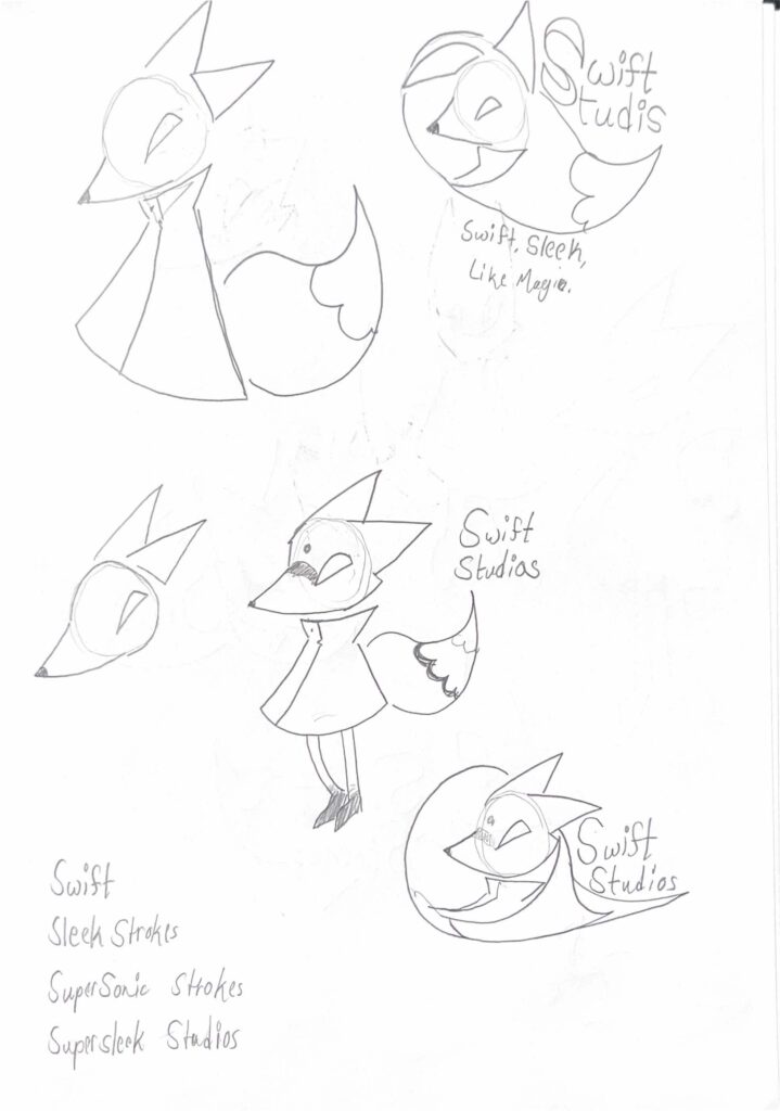
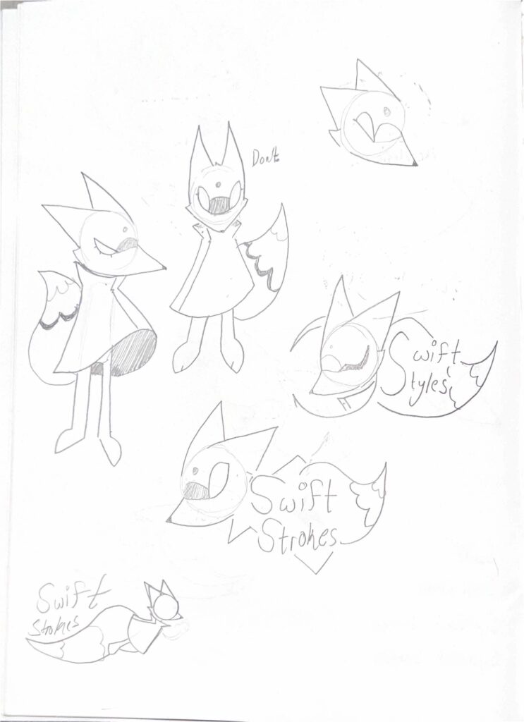
While concepting, I took heavy inspiration from Hornet, a character from Hollow Knight, particularly her dress. While what Fleet wears isn’t a dress, I figured it’d be fitting to have something so free on them. Kitsunes from Japanese folk lore were also a big part of their inspiration. I wanted them to feel almost mythical— of course, not in an intimidating way, more so in the way that might cause a client to put trust in us. From the sketches, you can see that they were originally supposed to have blank eyes… but this ended up getting changed in favor of making them more approachable.
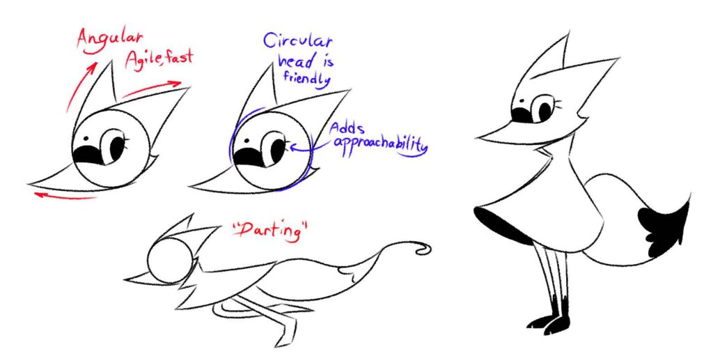
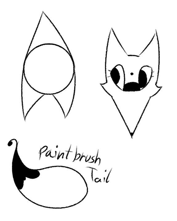
Above all else, though, the most important thing that needed to be conveyed was their agility and/or speed, a trait commonly associated with foxes. In a somewhat similar fashion to Sonic the Hedgehog’s earlier character design, they lean very heavily into more obvious shape language. I like to think that, in some part, it conveys to the clients that we make “sleek, sharp” designs. The paint brush tail was also pretty important, too. Because I plan to make animations of the fellow at some point, keeping things simple in a way that still gives information was key.
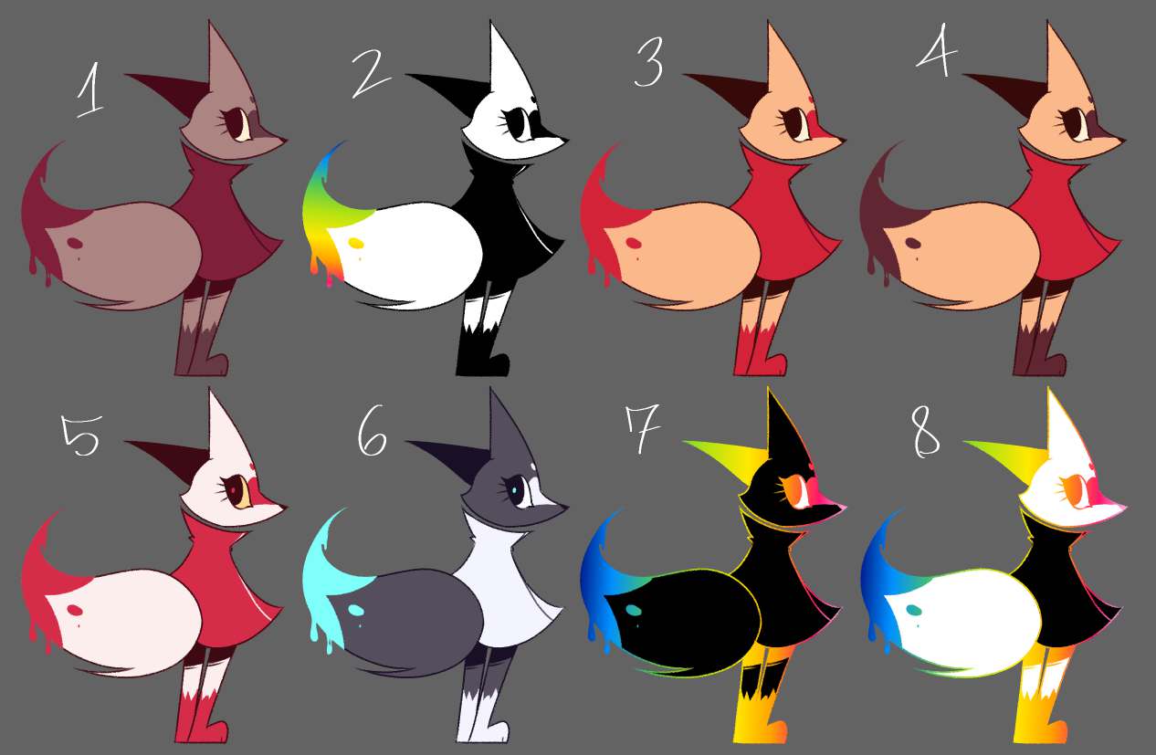
Lastly, these are the numerous palettes that have been considered to be used for Fleet. As the character evolve and brand as a whole evolve, there’s a chance one or two of these will make a recurrence. But as it stands, 4 simply felt the most fitting at the time. Warm colors, as of right now, simply feel right, as it makes for a welcoming environment. I did, however, take a strong liking to 2 and 7 aswell, as they allow for a lot of freedom… but may be hard to incorporate. Again, though, only time can tell what may or may not happen.
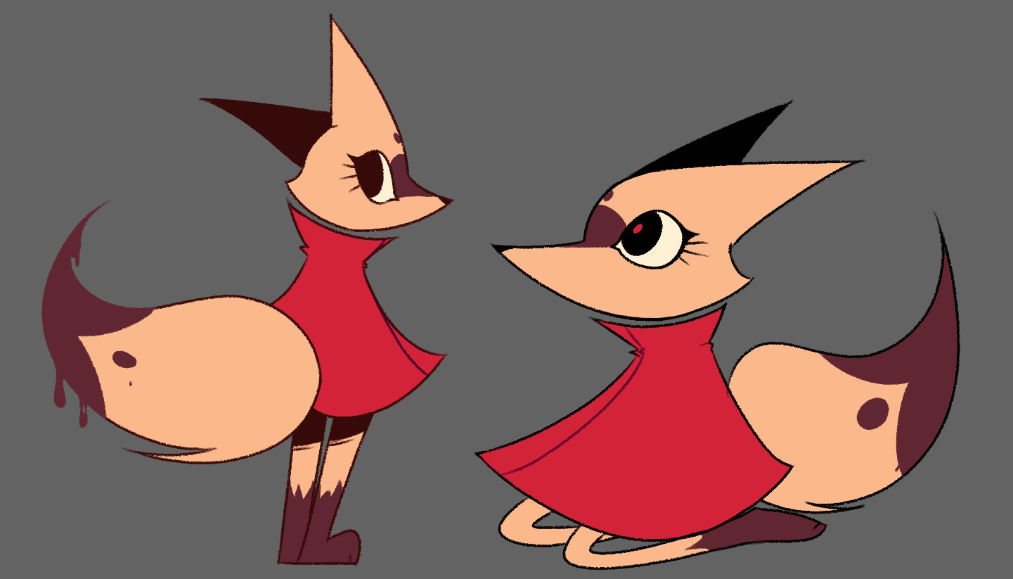
As of now, this is their final design; although it could be very well updated at any time as the site and brand evolve, and as I improve at my craft. I don’t usually work with characters on the more abstract side, so it was a fun and interesting experience to put myself through.
If this got you interested in seeing more, or made you want to collaborate with me, either check out more of my portfolio or get in contact!