
The goal of this assignment was to create an introductory title sequence in Adobe: After Effects for a short documentary that was filmed and edited in another class from that term. The project is required to have the title of the other assignment, at least three credits, and is supposed to incorporate principles of animation. It is also supposed to be 30 seconds long on the dot. Because my documentary was about people working with 3D software (specifically, Blender & Source Filmmaker), I knew I’d probably want something to do with their icons, considering I don’t do well with 3D as it currently stands.
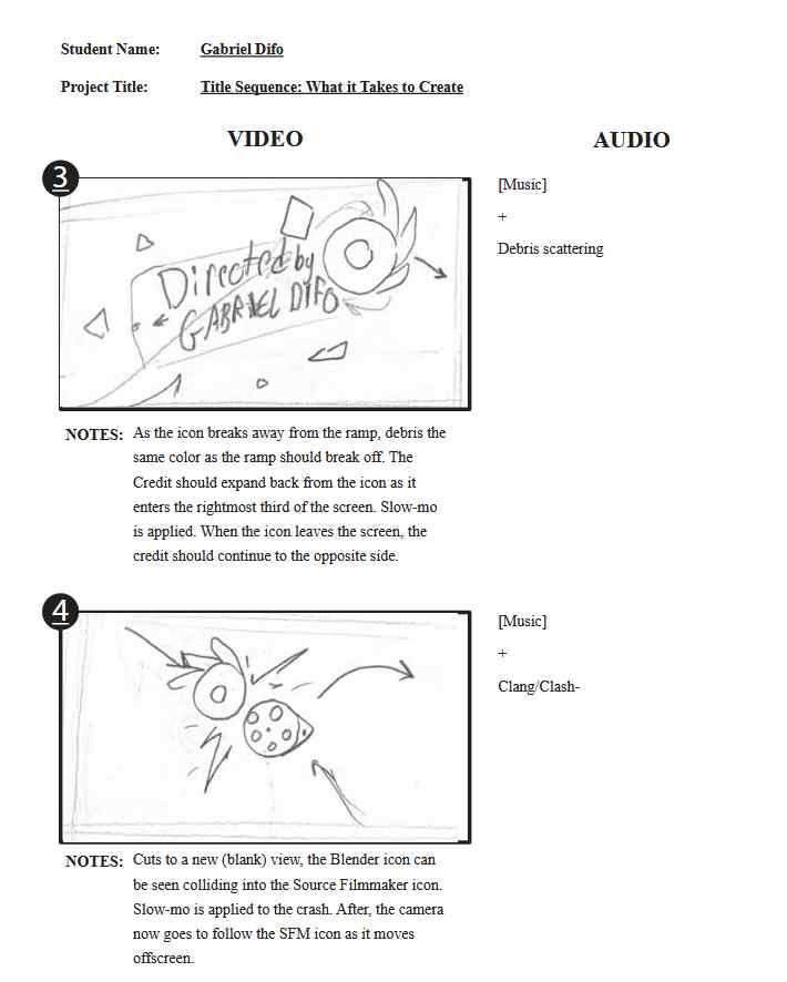
Going into storyboarding, I only had a vague idea of what I wanted to do… which was a lot of rolling due to the shape of both icons. I incorporated this idea much more at the beginning, which was the main idea behind the rolling downhill portion.
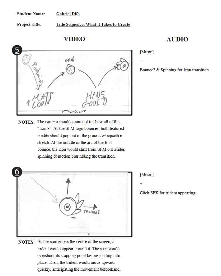
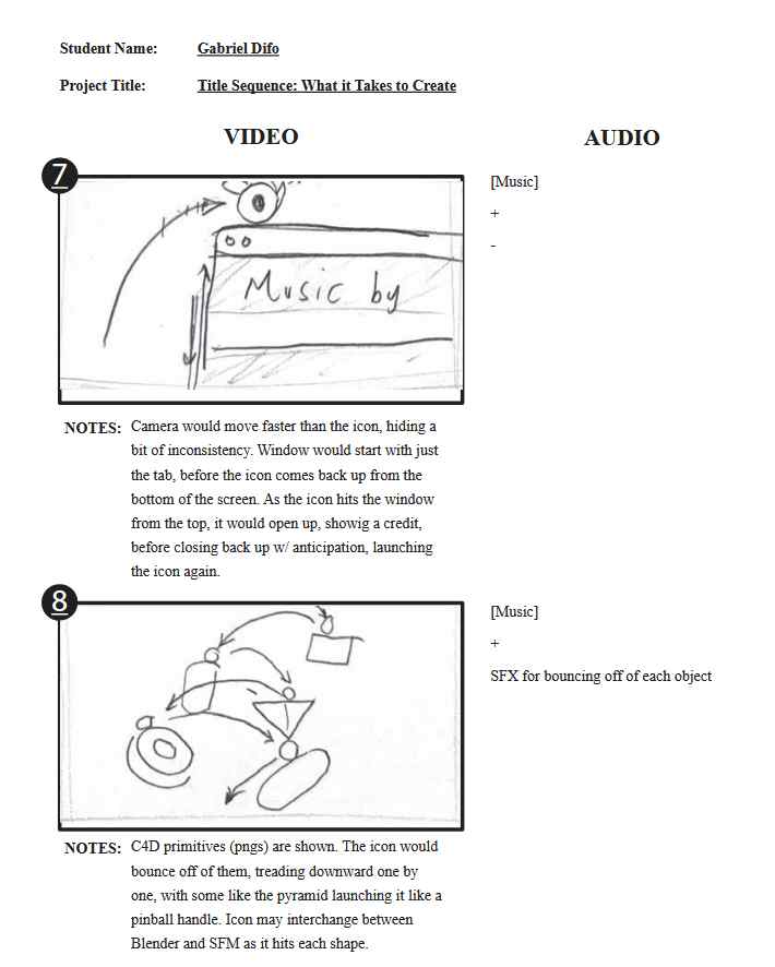
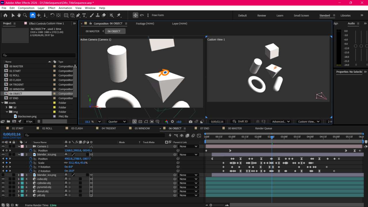
Mid-way through, I realized I wanted to incorporate more elements commonly associated with 3D programs- at least, to me. This is where the trident and objects come in. I figured the objects, all of which are Cinema4D primitives (a cube, cylinder, pyramid, donut & a pill), would be good representations of 3D work.
Though, that specific part would prove to end up being too difficult to properly translate into After Effects, so it would be downscaled… the rest would remain the same however.

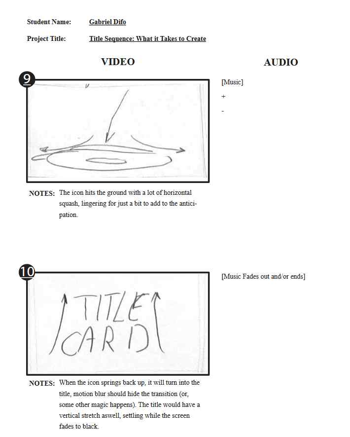
After the storyboard, I quickly went into Illustrator to make some assets to use in the project.
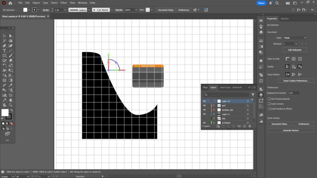
Unlike last time, the asset count on this project, I assumed, would be much, much less demanding, especially because I did not plan to illustrate any of it myself.
All that I truly needed to make was a ramp, trident, and a program window. I also made a simple, large grid, just in case I may need it to emulate the backgrounds you usually see in 3D programs. Although, this never ended up being used.
As for the Blender and Source Filmmaker icons that would be used, I simply grabbed clean images of them off of Google Images.
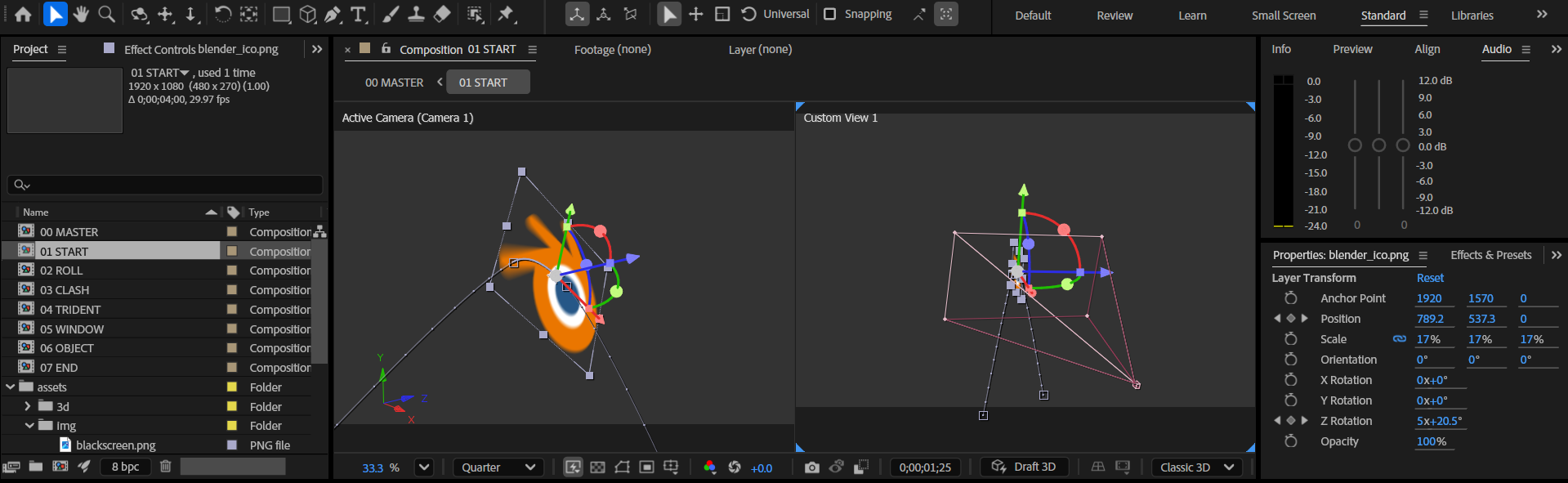
Once the assets were done, I jumped right into starting the animation. While I used a similar work flow to the last After Effects project, I touched up the process to be better organized. This helped a lot more with keeping track of everything. Even if its all internal, I feel it is important to mention.
With that in mind, I actually went about the process a little bit more linearly this time, although this is because I did not want to make timing an absolute nightmare later on.
This time around, I had to play around a bit with the “Shatter” effect for the debris seen in the storyboard after the icon jumps off the ramp. I figured using this would be much better than having manually drawn and animated pieces of debris, even if they provided more control… while I originally wanted much less shards on the screen, the end result ended up growing on me.
Pretty much every scene in this project also utilizes the 3D mode in After Effects, and much more effort was put into making the camerawork just right… in about 3 scenes (originally 2), the camera was made to follow the subject, which proved to be difficult to line up… though I believe I lucked out, since this did not take too long.
Originally, “03 CLASH” was meant to be split into two separate compositions, but I figured having the camera follow the SFM logo would work much better for the overall flow of the video.

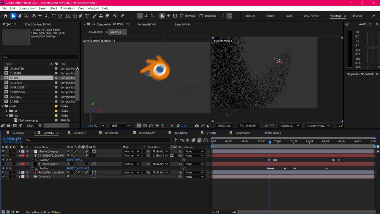
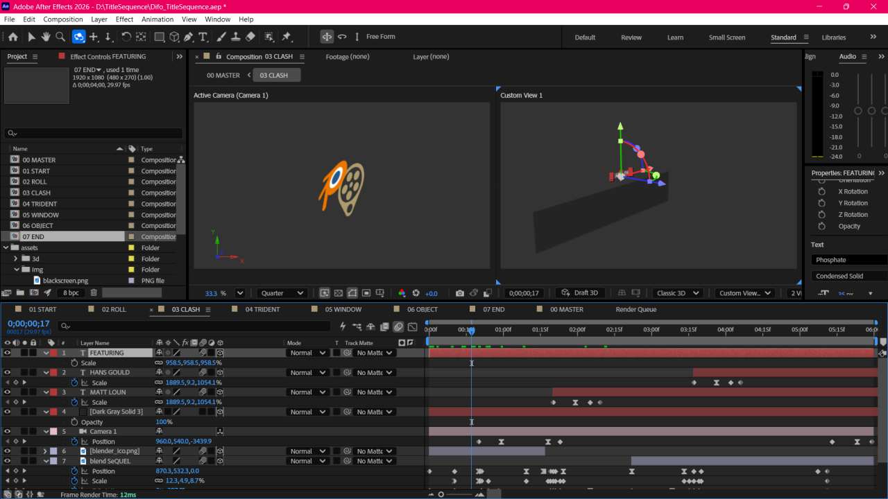

Though it may seem out of place, I like to think of the countless number of little program windows when the thought of a 3D program comes to mind. That, and I also think the window opening up was simply a nice idea.
Initially, I wanted all of the primitives to jostle when they were hit by the Blender icon… however, I do not dislike the direction I ended up going, and I believe the resulting animation of that section turned out much better than it probably would have, given it would have been much more effort in a specific area that I have not practiced much with.
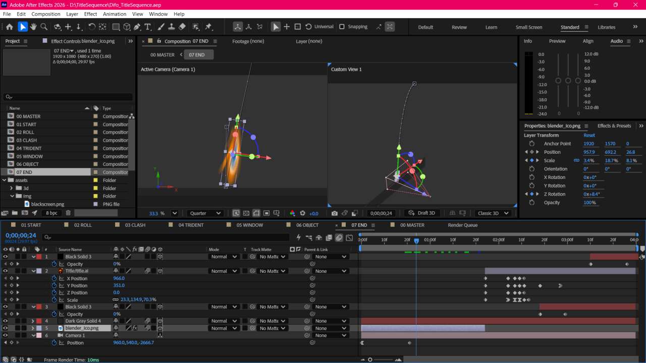
The last scene ends with another instance of the subject being followed. The camera pulls a lot of weight in making the 3D components useful, as I feel that if a camera could be used outside of there, I probably would not be using it right now. The way this project was structured did not at all call for any focal blur or aperture, though I believe the camera’s movements on their own more than ,make up for that fact.
Ultimately, although there were much less overall scenes in the composition despite being double the length in comparison to the Diroama, I feel like the fact that the sheer amount of keyframed elements in this project make up for that. Most assets, especially the icons, move and bounce around a lot, so extra care was used to ensure they didn’t look (too) jarring or rigid. On the contrary, sound effects and music took much more of a backseat this time, as I did both of those only after basically the rest of the project was finished.
^ VIDEO HERE WHEN DONE
While I feel I could have done more in the background design department, I also feel that it encapsulates the feeling I get from an empty Blender or Cinema4D work area very well.
If this got you interested in seeing more, or made you want to collaborate with me, either check out more of my portfolio or get in contact!
[…] the work flow I used for this project wouldn’t end up being adjusted and improved until later– namely for organization- I believe it was the right choice for me to […]